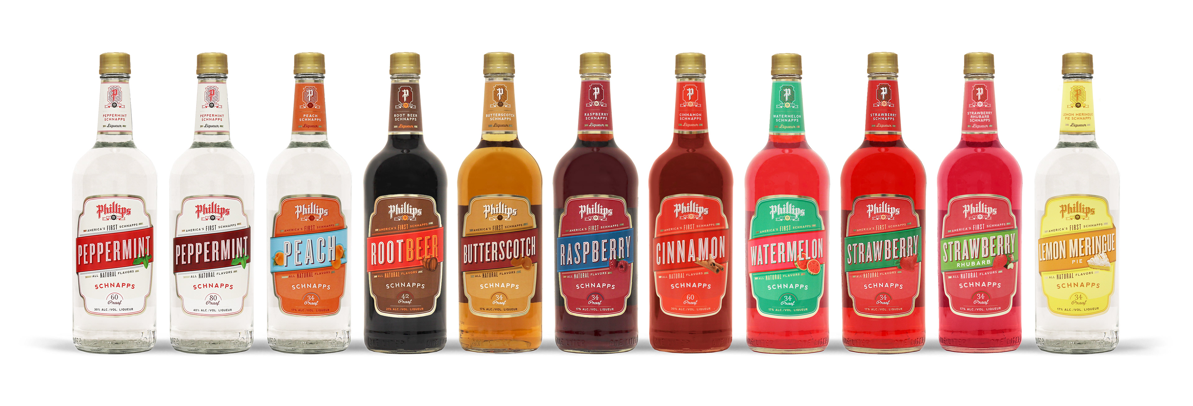
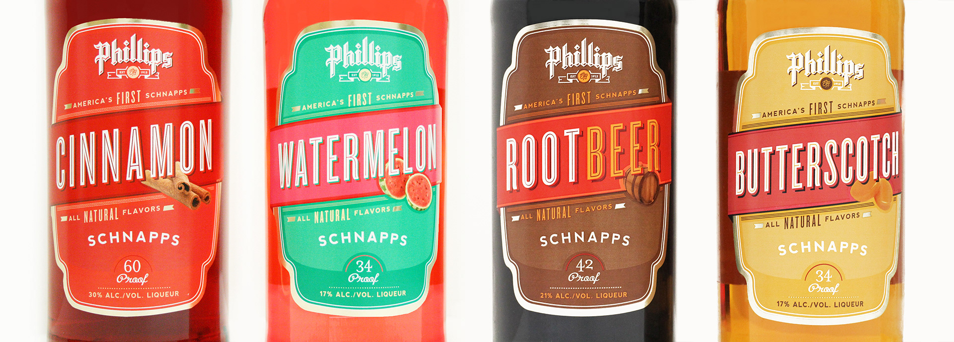
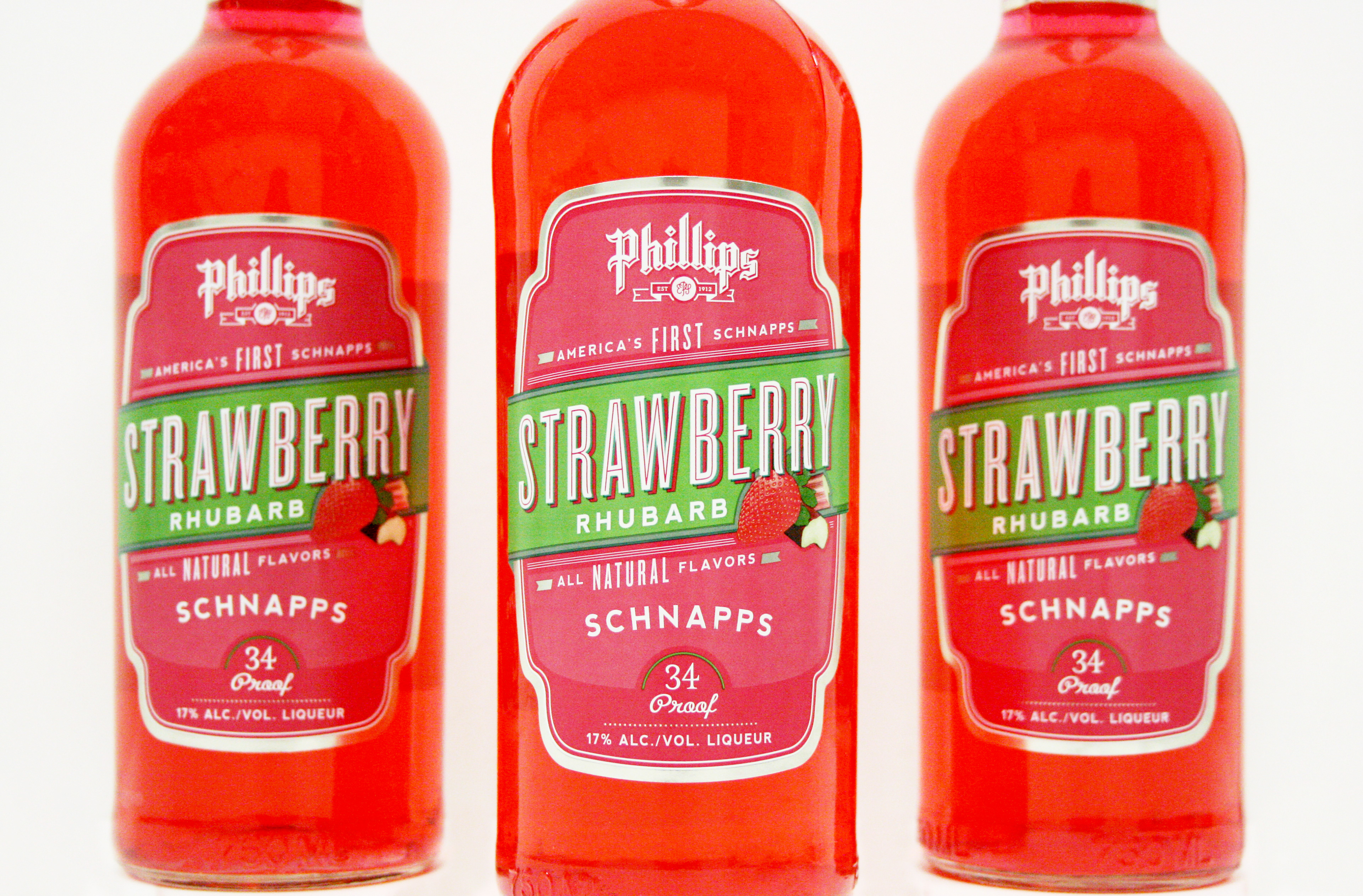
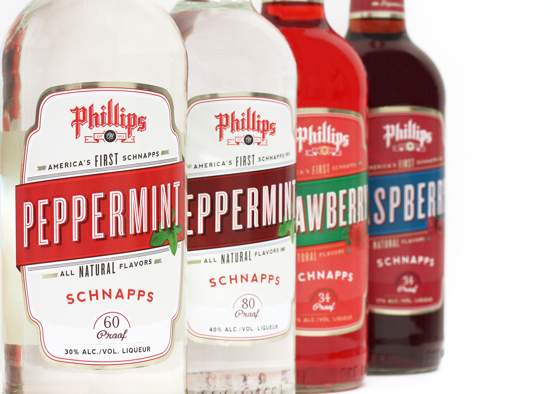
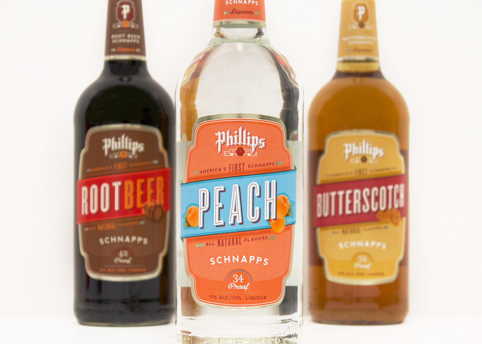
The Phillips Distilling product line is a family full of spirit. Over the years they have launched hundreds of high quality spirit brands. Their schnapps line was in need of a brand refresh. With over 10 flavors launching over the last decade, their labels were starting to lack consistency.
It was time to bring life back into the historic brand and make the labels uniform and relevant once again. Now, each product is set apart with distinctive typography, color, and a corresponding flavor image. The entire product line is easy to recognize on shelf and quick to communicate the flavor.
Scope: Rebrand (utilizing existing logo), Label Design, Package Design
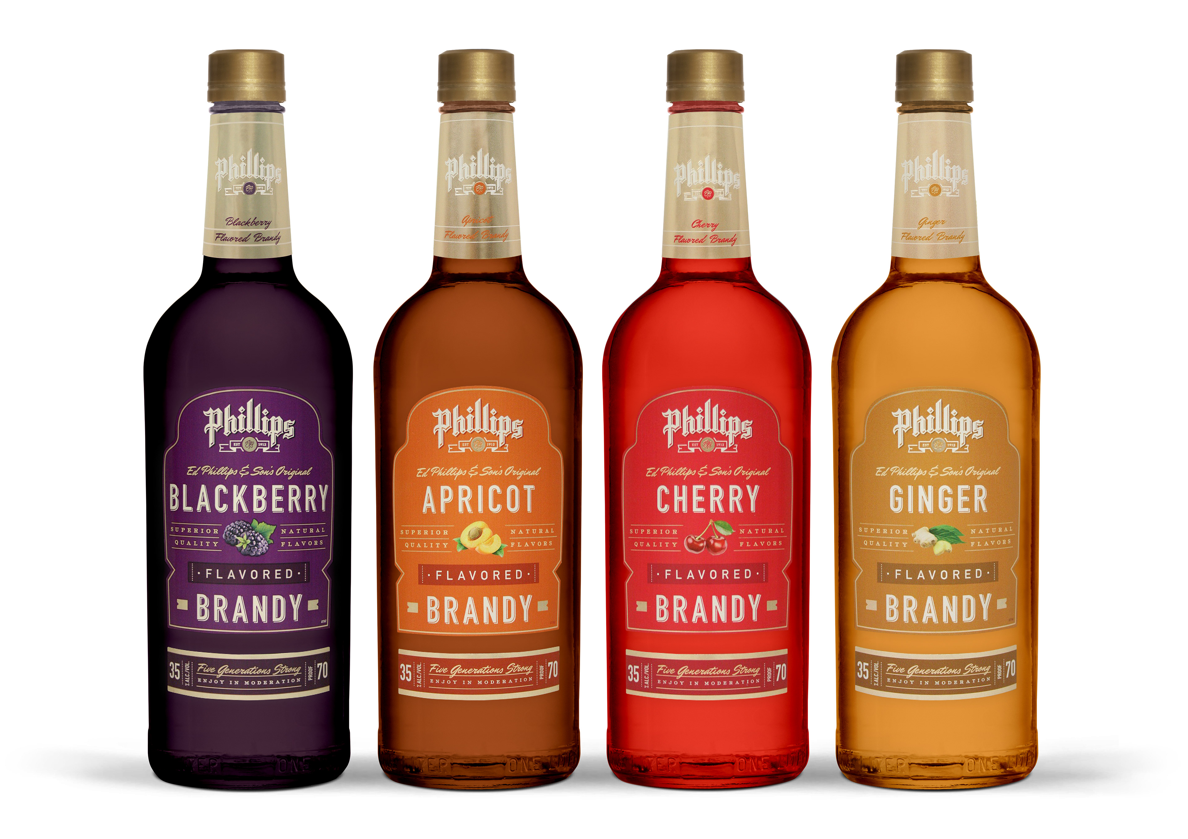
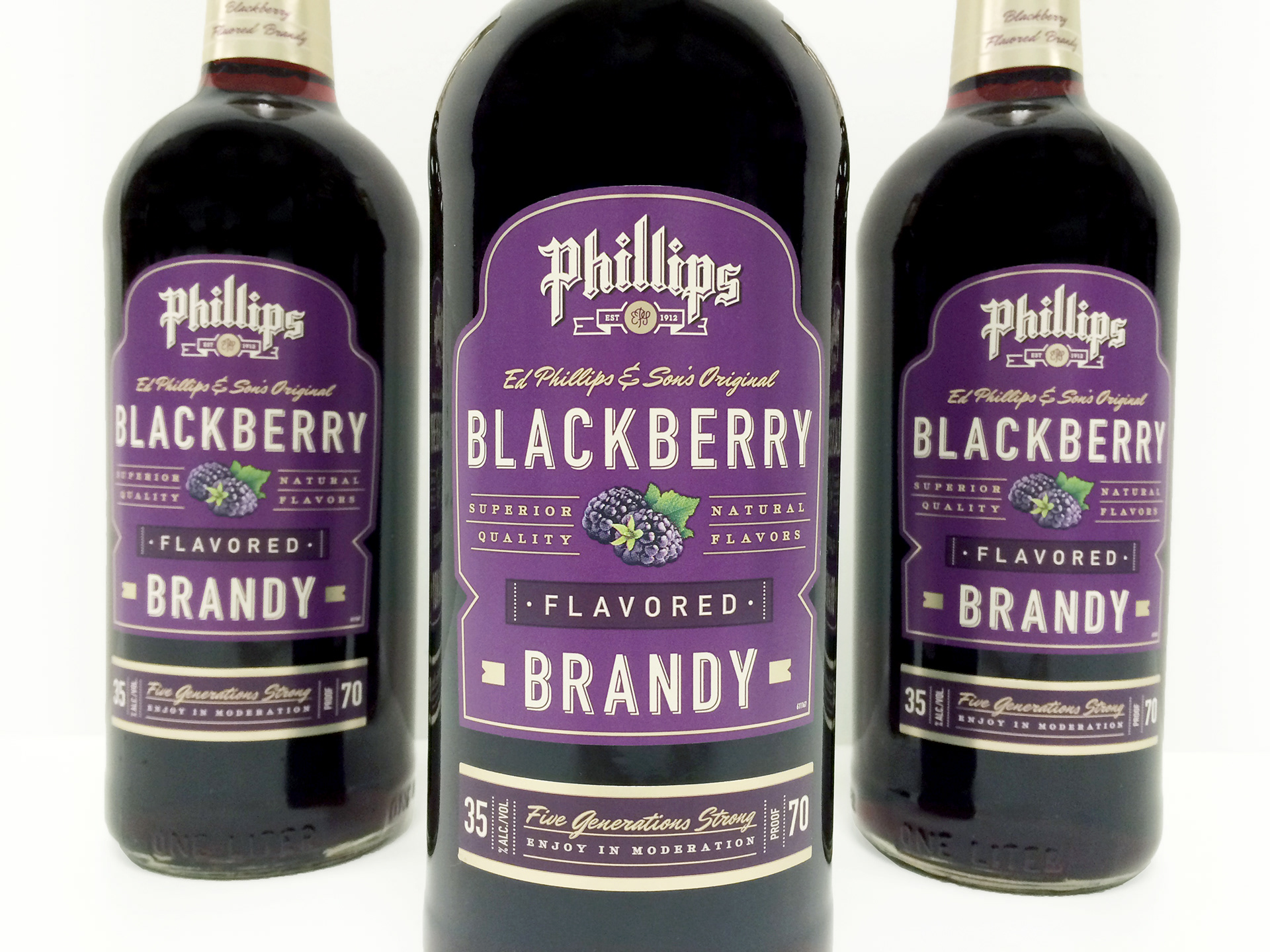
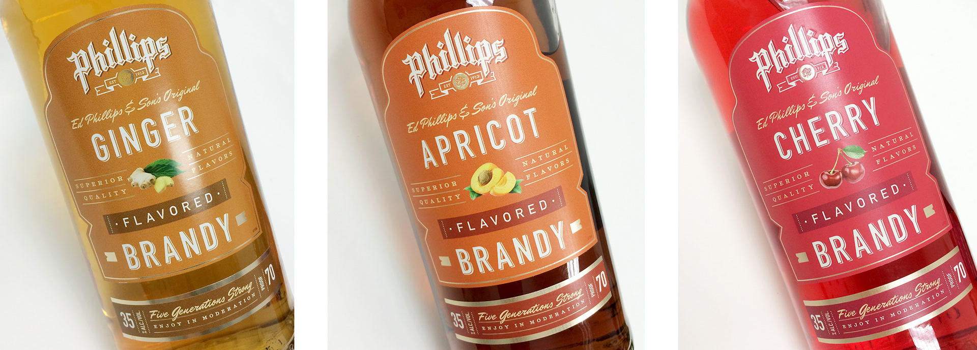
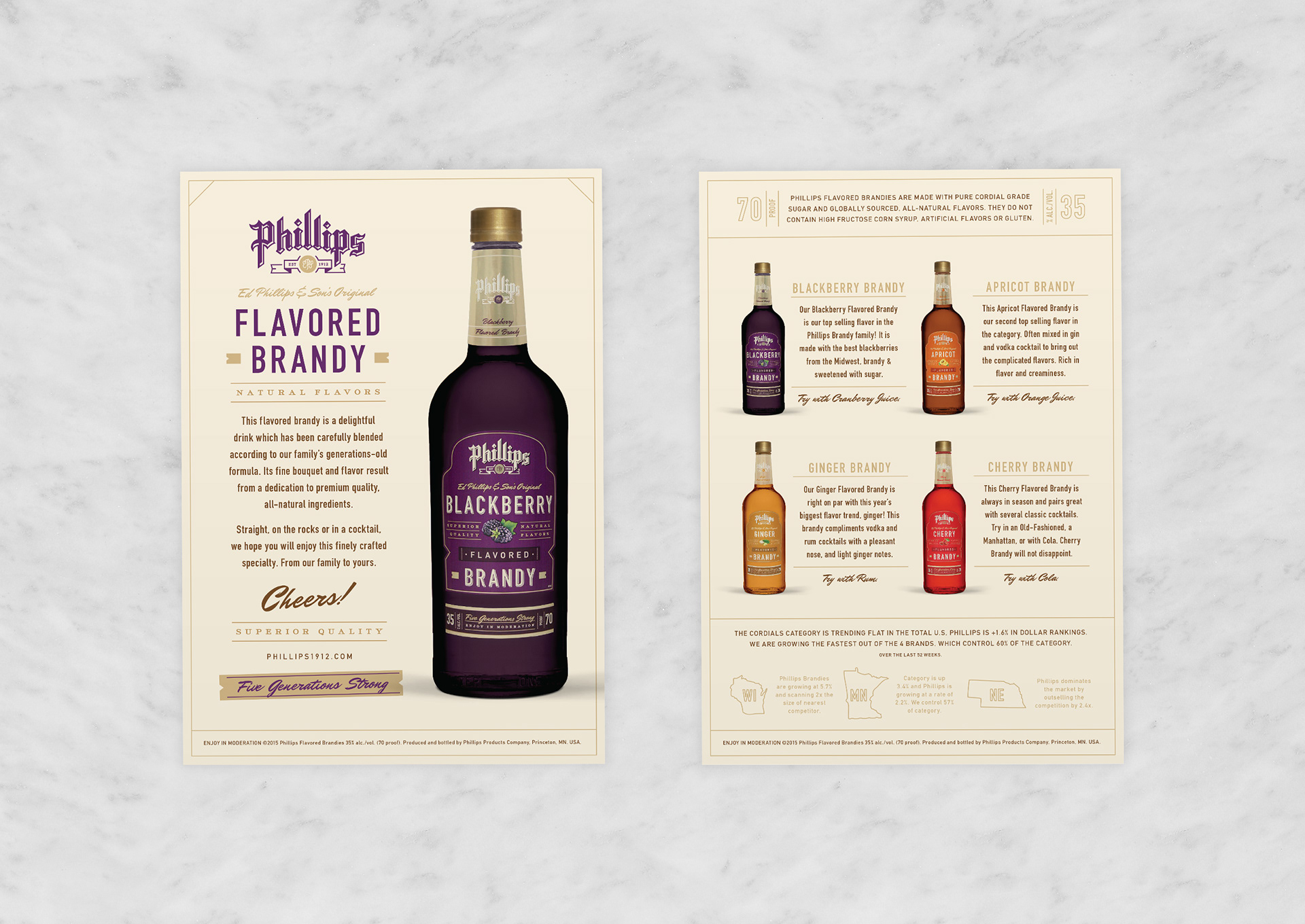
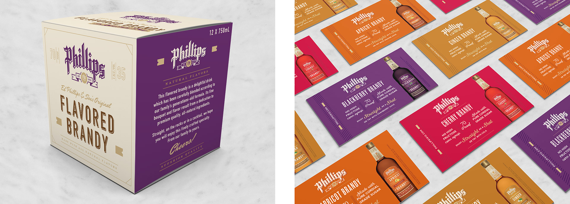
In addition to redesigning the Phillip Schnapps product line, the Phillips Flavored Brandies were also in need of a face lift. The Flavored Brandies are a delightful drink that has been carefully blended according to their family's generations-old formula. Its fine bouquet of flavors result from a dedication to premium quality, all-natural ingredients.
They wanted their labels to look more upscale then their competitors. We used simple typography, hierarchy and gold graphic elements to make the labels more premium. The color palette stayed the same as to not confuse current consumers.
Scope: Rebrand (utilizing existing logo), Label Design, Package Design, Brand collateral