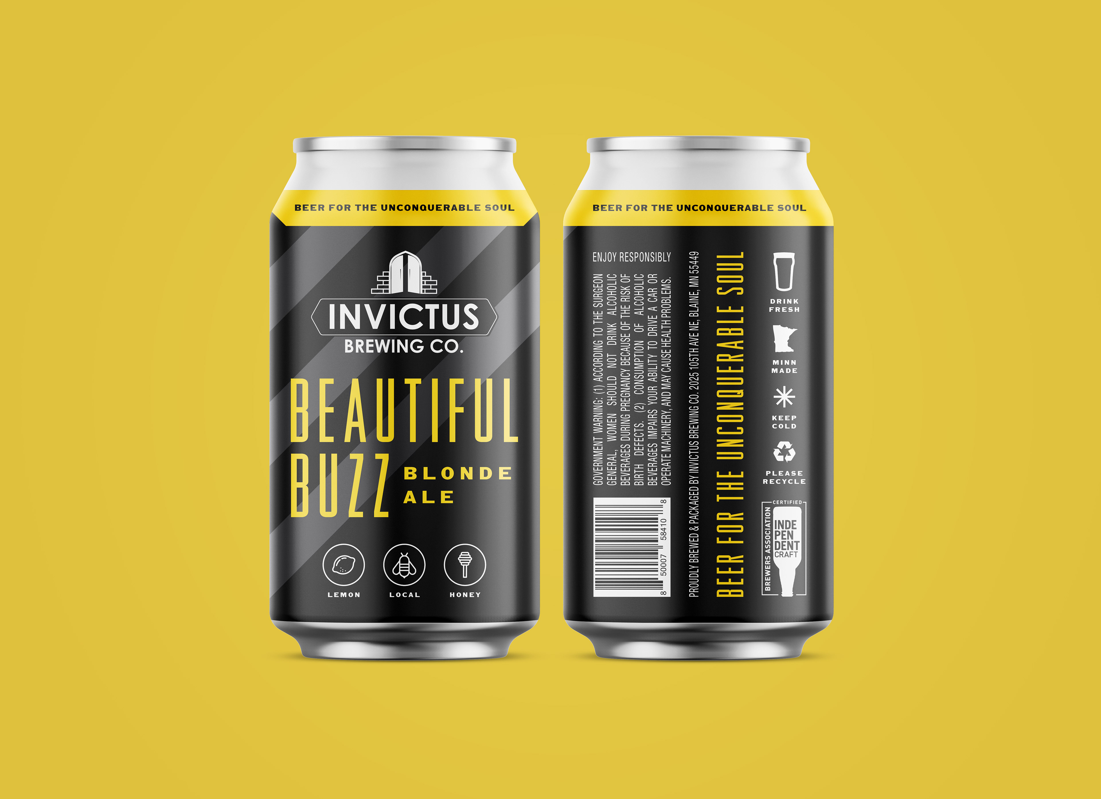
Invictus Brewing Co. opened their taproom in Blaine, Minnesota in 2018. The word "Invictus" is Latin for "unconquerable" and is a poem written in 1875 by William Ernest Henley. The poem is a testament to the unconquerable human soul, which inspired their tagline "Beer for the Unconquerable Soul". Their mission is to produce high quality beers for adults to enjoy while also being good stewards of our earth and resources.
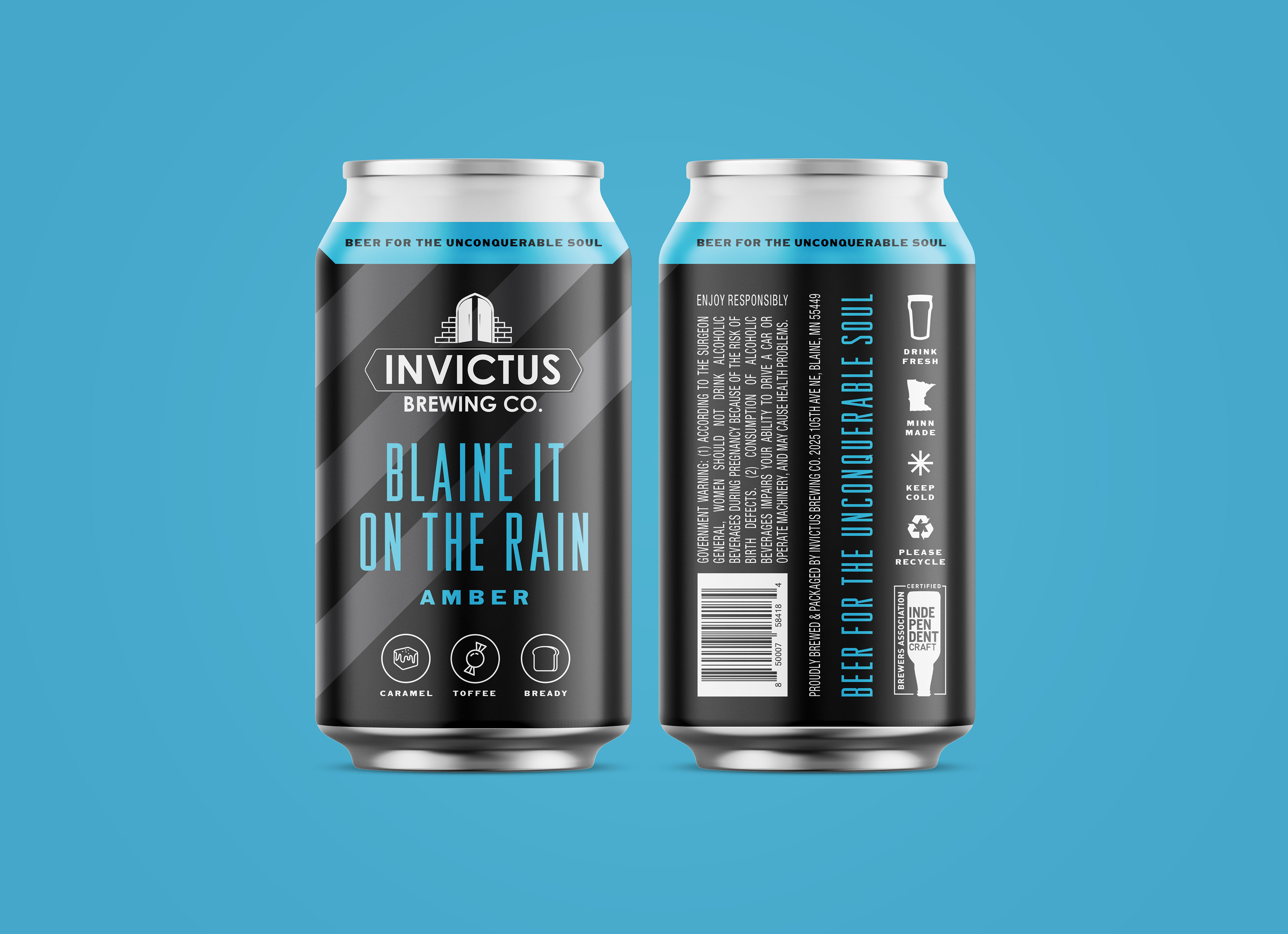
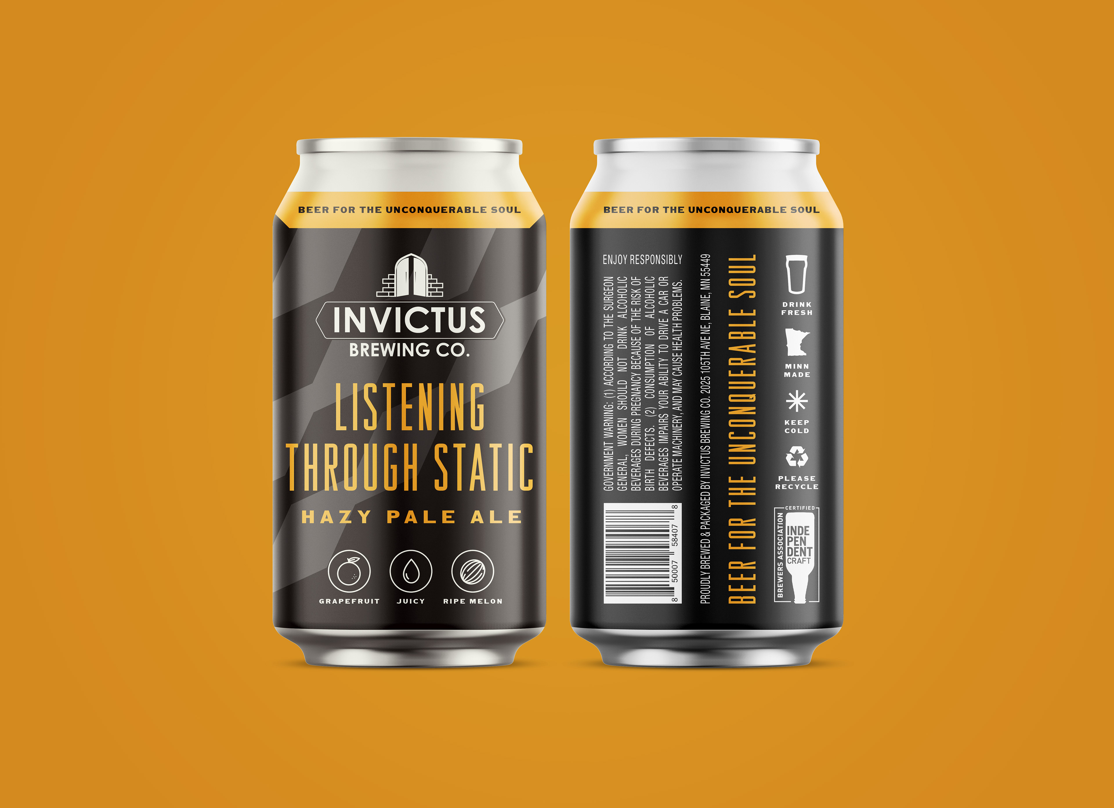
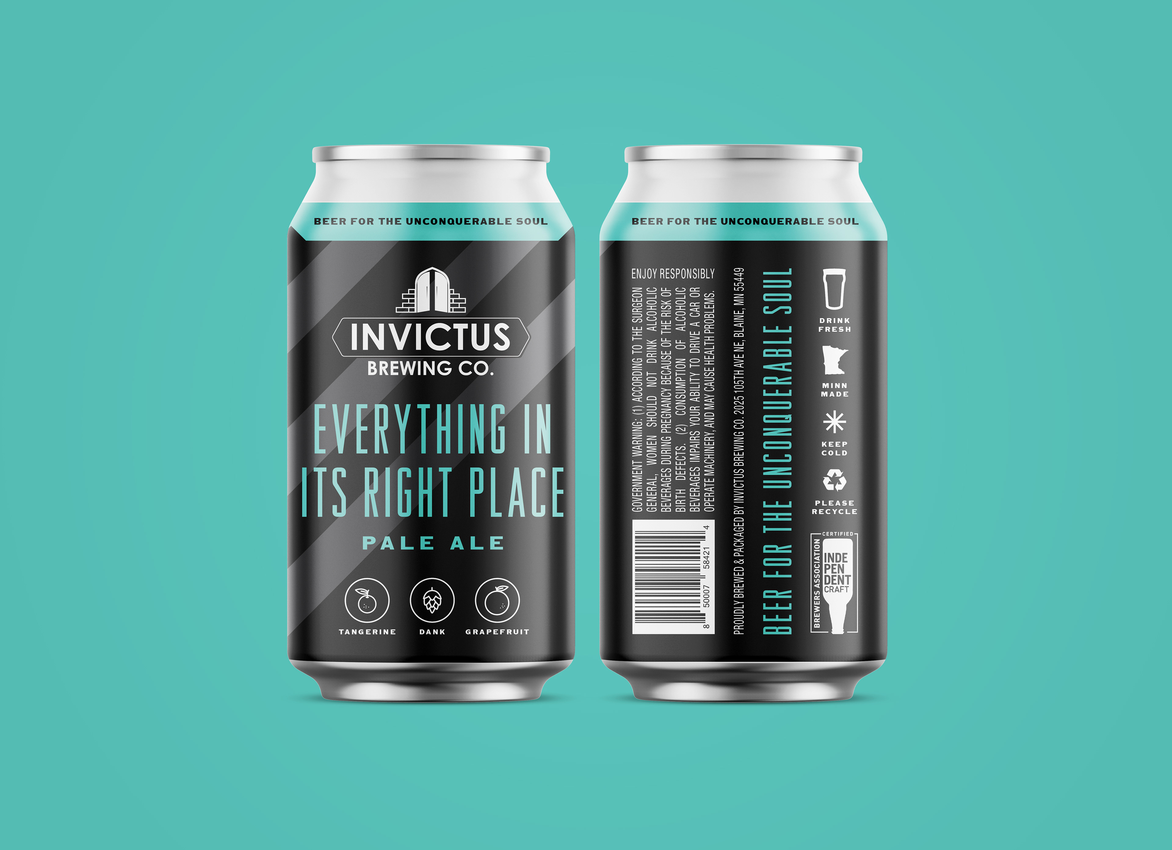
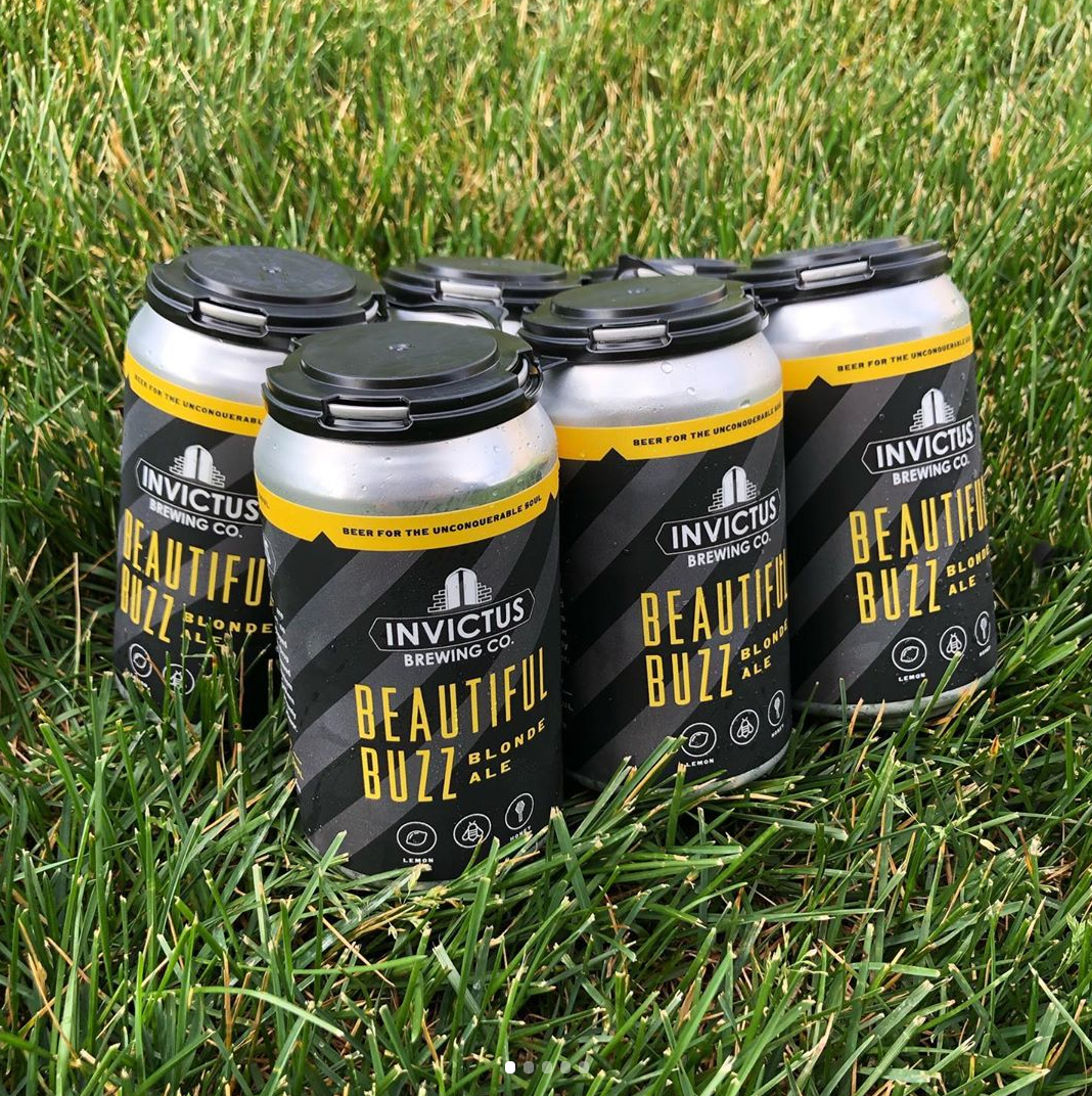
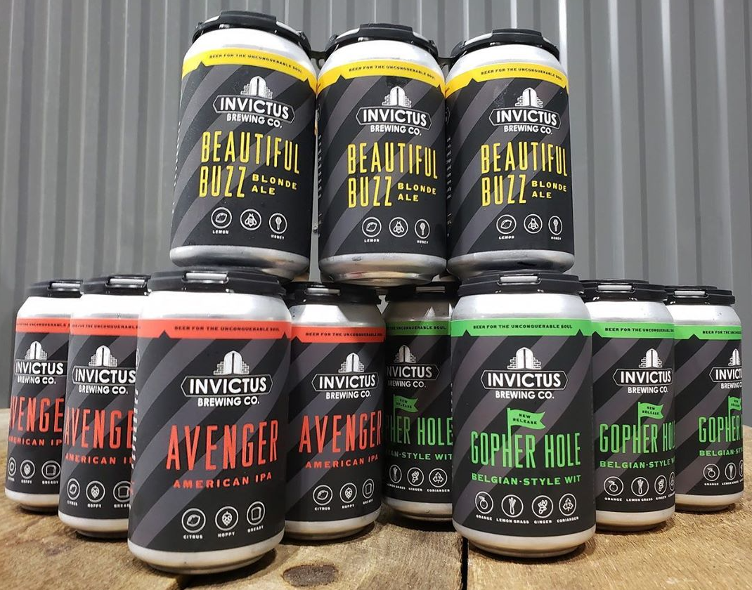
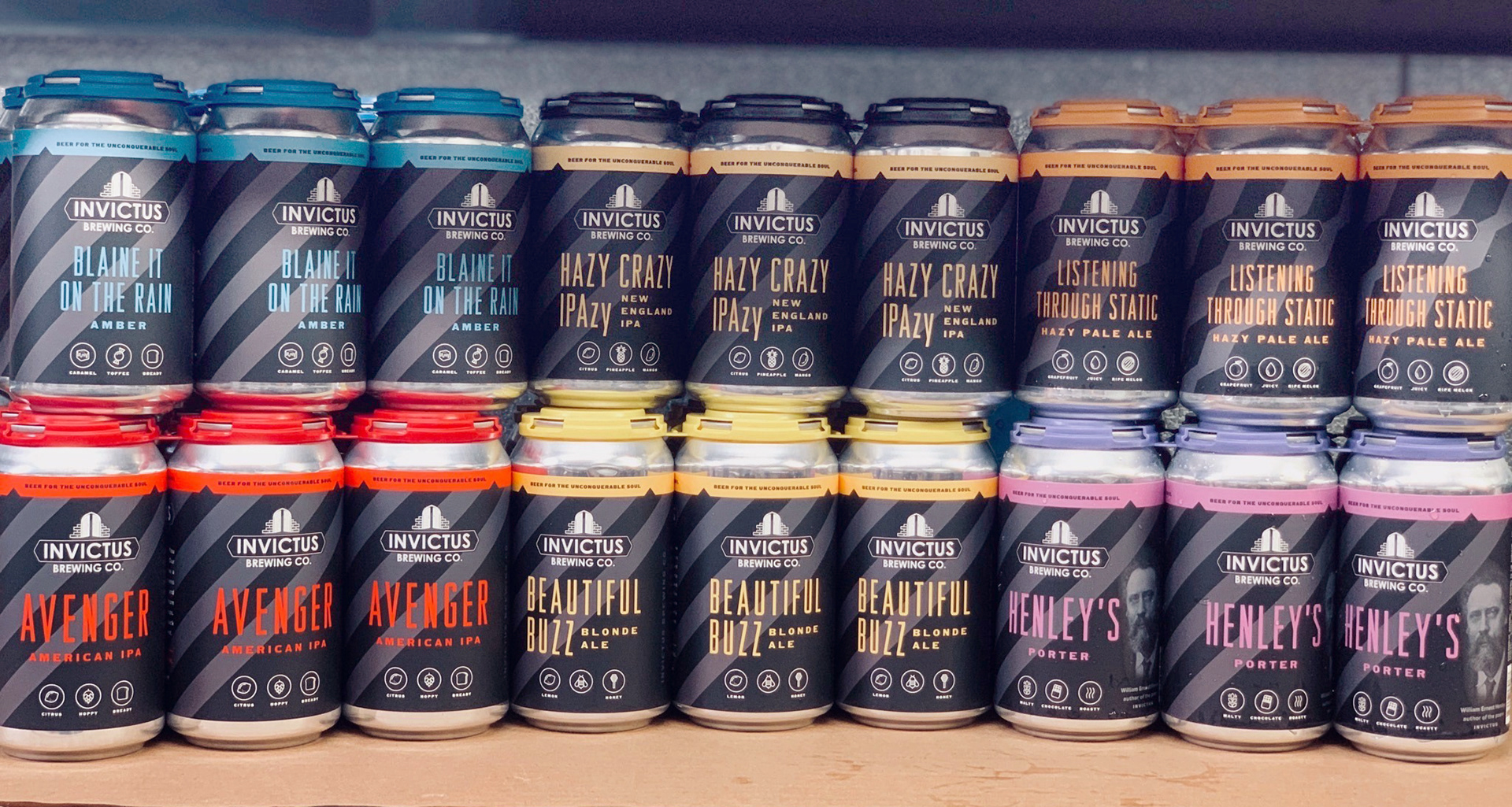
In addition to serving beers in their taprooms and local bars, Invictus was ready to start selling cans at liquor stores and special events. With a logo already developed, I took on the challenge to develop a label design to fit their current cans. Invictus was looking for a design that would replicate well with multiple beer flavors and also stand out on shelf. We created a grayscale striped pattern for the label background and layered bright typography and flavor icons over the top to make the content really pop. We've designed just under a dozen labels so far and there's always more in the works!
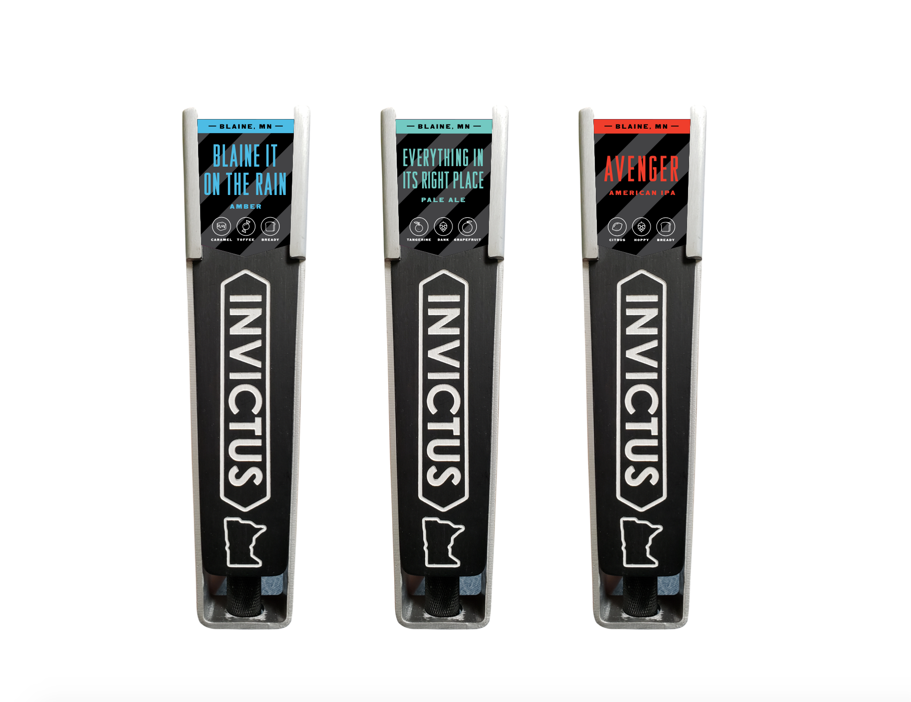
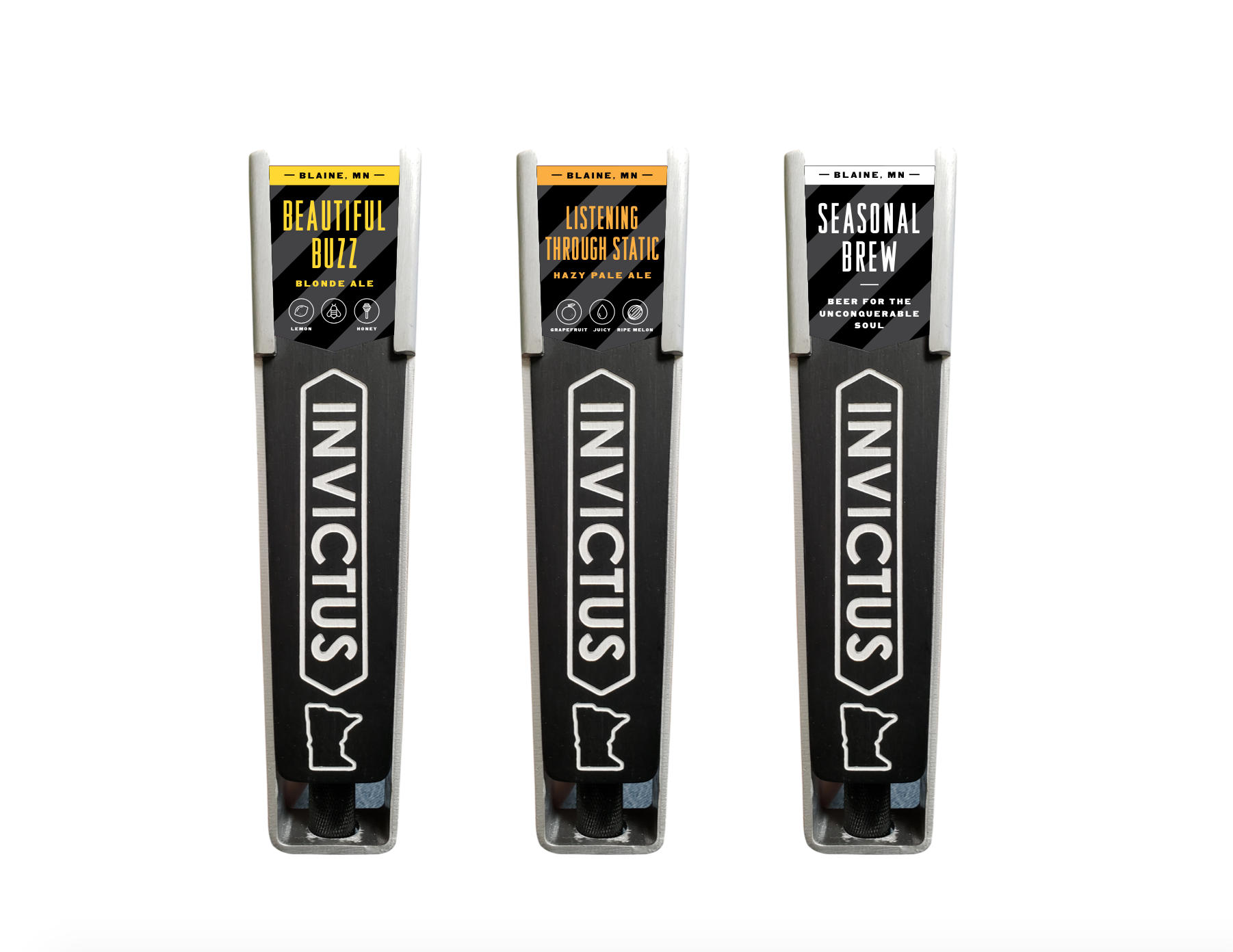
We've also created tap handles designs.
Scope: Rebrand (utilizing existing logo), Label Design, Collateral
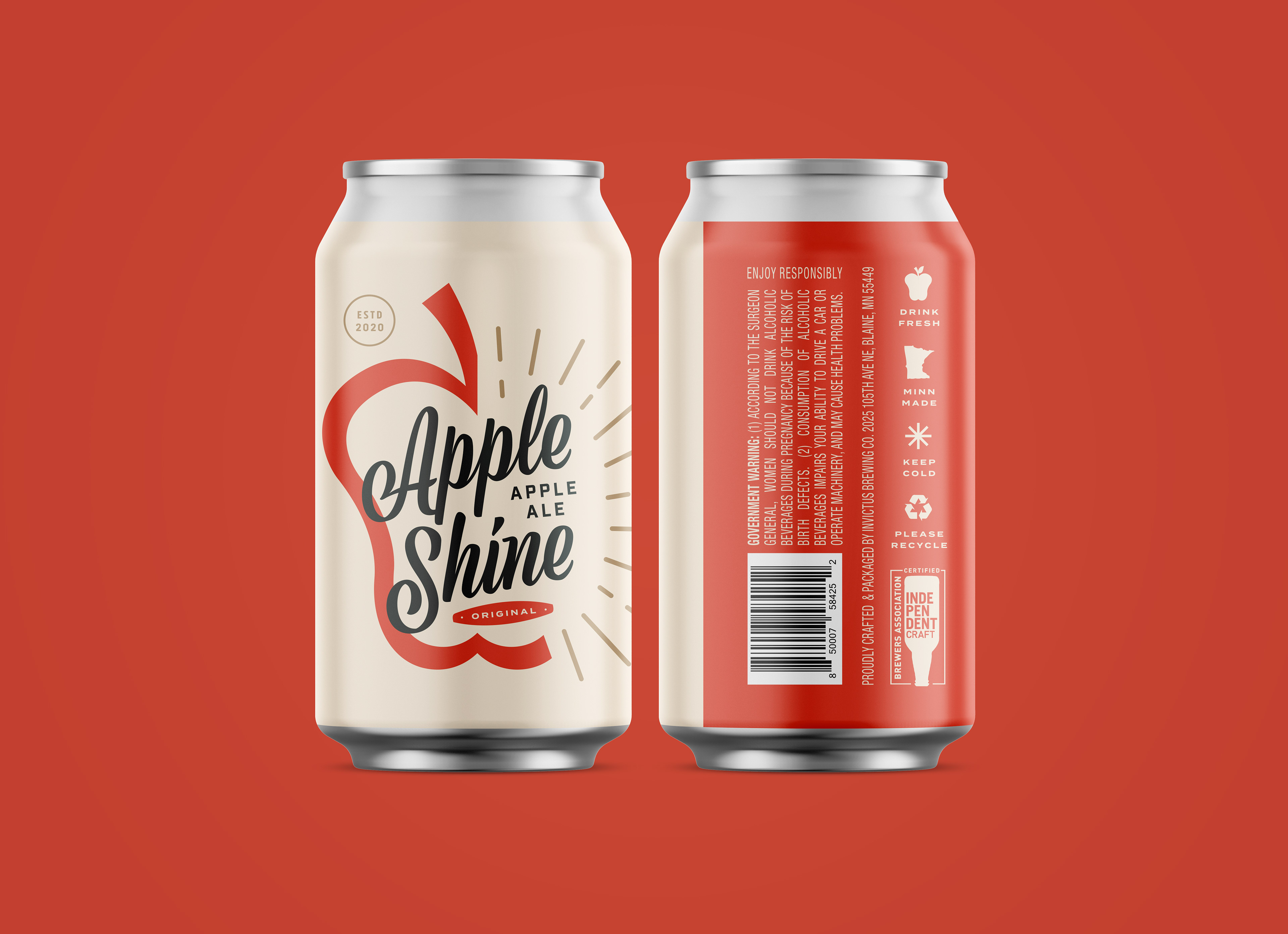
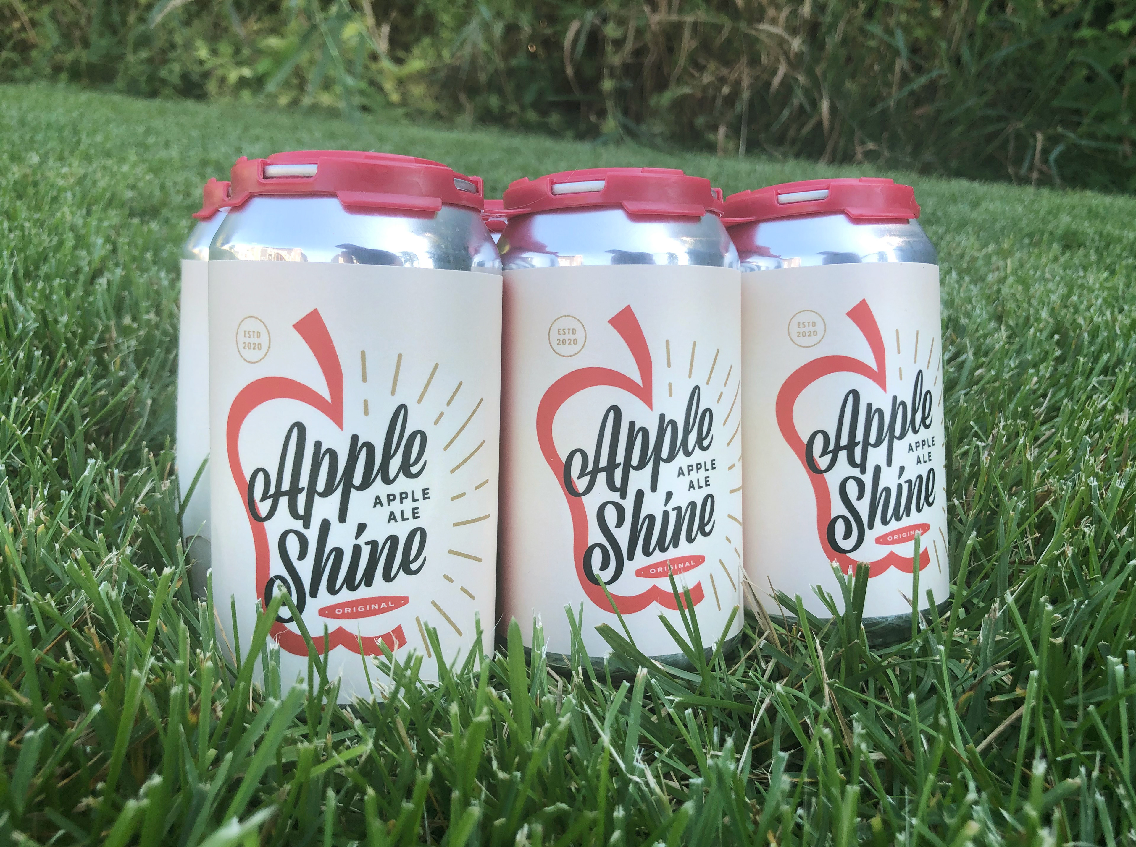
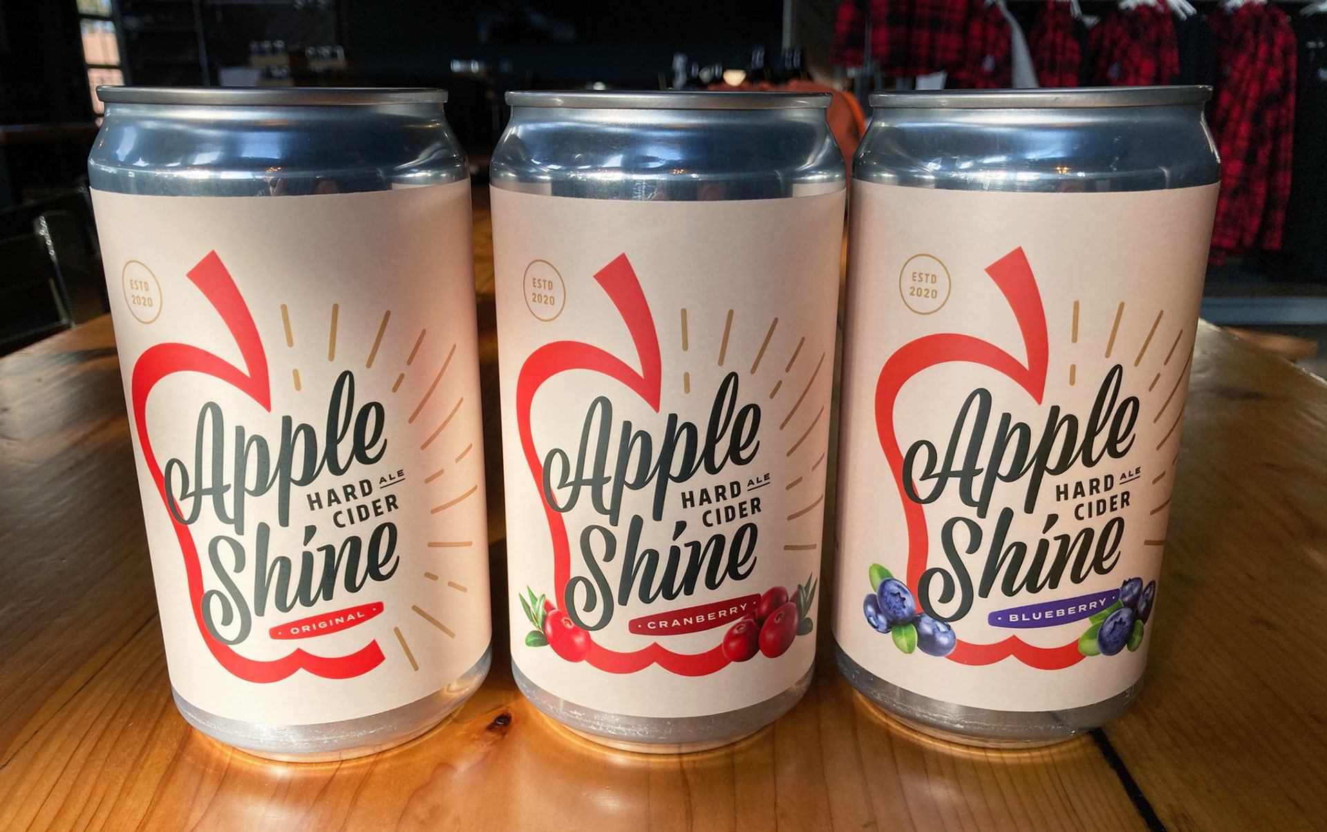
Invictus Brewing Co. created a new, gluten-free cider to add to their 2020 lineup! This cider has been appropriately named Apple Shine and has a dry, crisp and tart flavor profile and is made with apples from the midwest.
Invictus wanted to can this cider, so they were in need of a new label design. They wanted to take a unique approach to the design and have them look completely different than the original Invictus labels. We took a literal and graphic approach to the name "Apple Shine" and created an apple graphic with a radiating sunburst for the logo. And kept the color palette neutral and flexible to expand into other flavors. Keep an eye out, for more flavors are on the way.